
Contributed by Michael Brennan / The 60th Venice Biennale runs through the fall. This storied, much imitated global event, like an Olympics or World’s Fair, consists of individual national pavilions and topical exhibitions. They occupy Venice’s Giardini and Arsenale. The Biennale generates numerous collateral exhibitions in palazzos, churches, and former warehouse spaces citywide. In addition to the officially sanctioned shows, there are a myriad unaffiliated exhibitions that try to pass themselves off as part of the Biennale by insinuation. It’s a lot to take in.
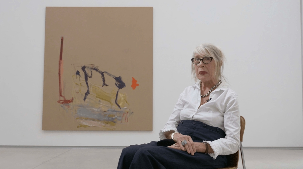
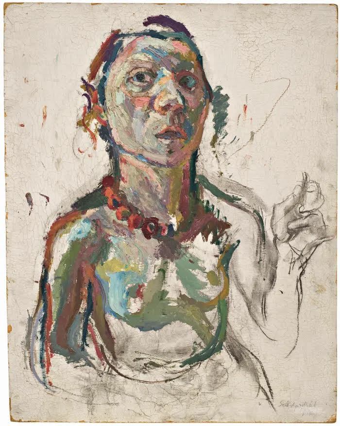
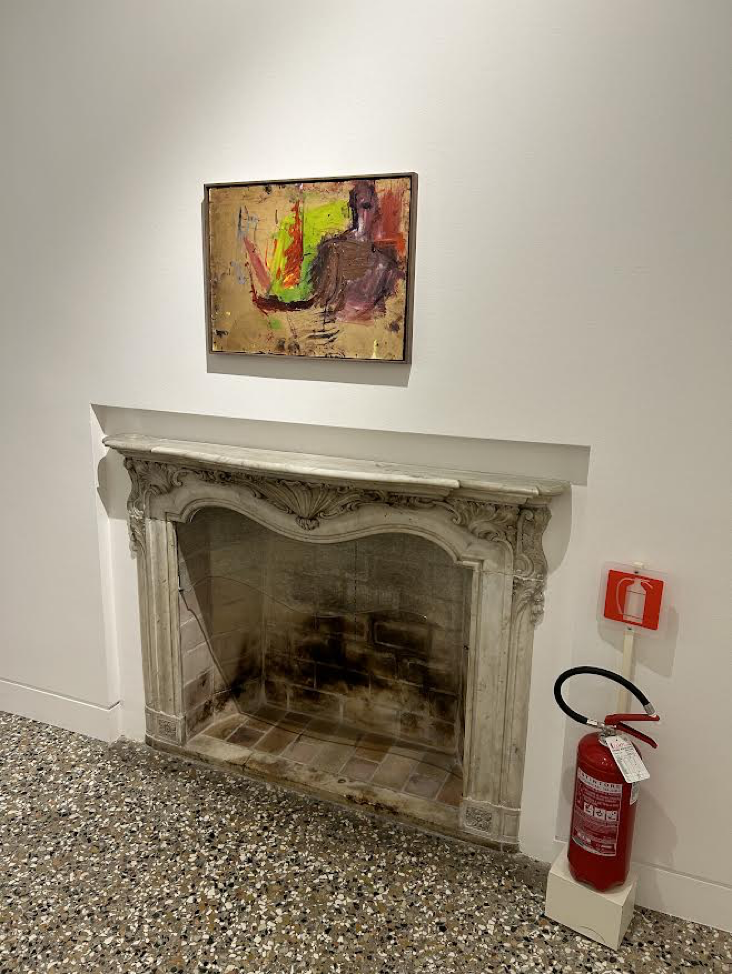
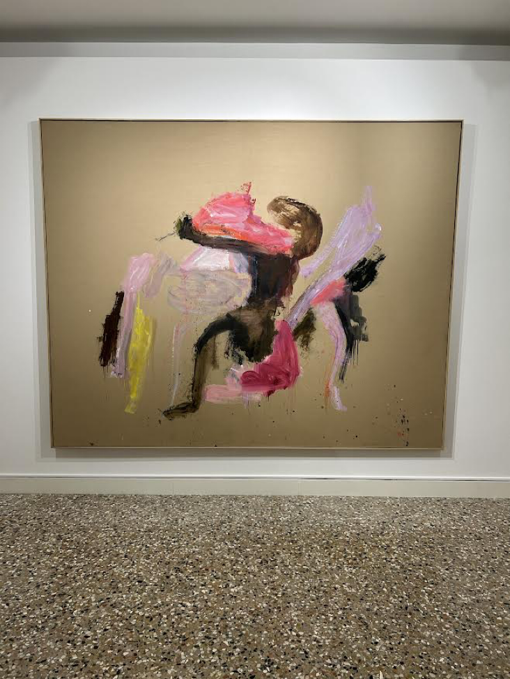
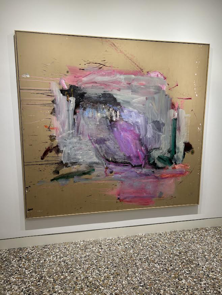
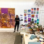
My favorite exhibition was a strong survey of Martha Jungwirth’s paintings in Dorsoduro’s Palazzo Cini.
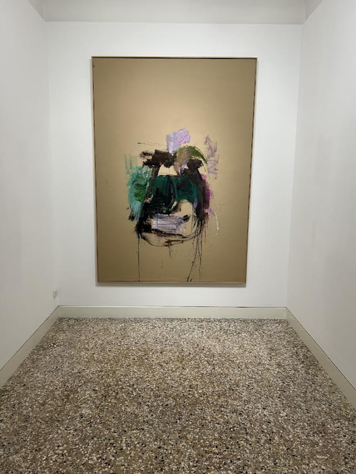
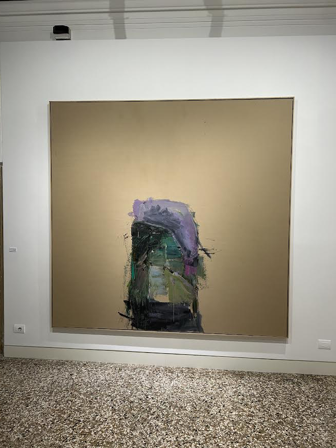
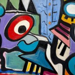
Titled “Herz der Finsternis” after Joseph Conrad’s iconic 1899 novella Heart of Darkness, the show includes about a dozen large and small paintings on cardboard. In most cases, the cardboard is seamlessly mounted onto stretched linen, lending the commonplace material the gravity of fine painting. It is nearly the color of Kraft paper, but it is not necessarily neutral. Sometimes the cardboard surfaces appear flat, utilitarian, and dun, while at other times the unpainted areas enshroud Jungwirth’s tightly painted gestural clusters in a warm glow, as cardboard absorbs spotlights well.
While the work’s connection to Heart of Darkness is not evident in intelligible images, Jungwirth, who was born in Vienna in 1940, in resolving each work to a dark expressionistic core, Jungwirth alludes to the exploitative European colonialism in Africa that Conrad critically identified, and she believes has continued.
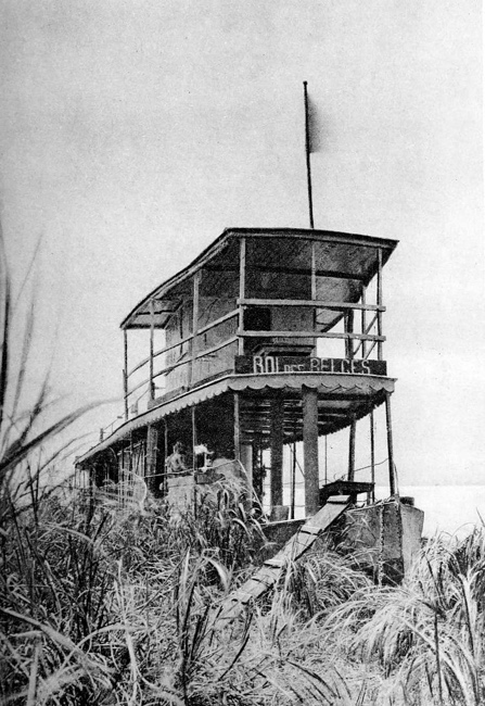
King of the Belgians, the riverboat commanded by Joseph Conrad in upper Congo
Martha Jungwirth at Palazzo Cini
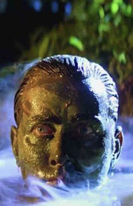
Martin Sheen as Willard in Apocalypse Now
On a technical level, her cardboard-based set-up is inventive, simultaneously grand and casual. Oil paint and this material combine devilishly, like smoking and drinking or coffee and donuts. Oil on paper is considered a conservation no-no, which has something to do with drag, absorption, and cardboard’s high acid content. Yet Constable’s oil sketches on paper survive, and Franz Kline’s studies on the thinnest, cheapest, most acidic phonebook pages still exist. Even if the medium isn’t ideally archival, it might not matter much at this point. Jungwirth’s brushwork is lively, and she has a great feeling for placement, density, and mass. Her telltale drips often reveal the rotation of a painting, and with it the artist’s muscular paint handling and process. In a festival atmosphere that often valorizes an airy approach these substantial, implosive paintings were refreshing.
Here’s a video of the core chamber in the Palazzo Cini:
Jungwirth’s work has quite a bit in common with that of her Austrian compatriot, Maria Lassnig, born in 1919.
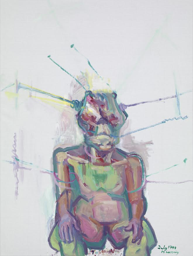
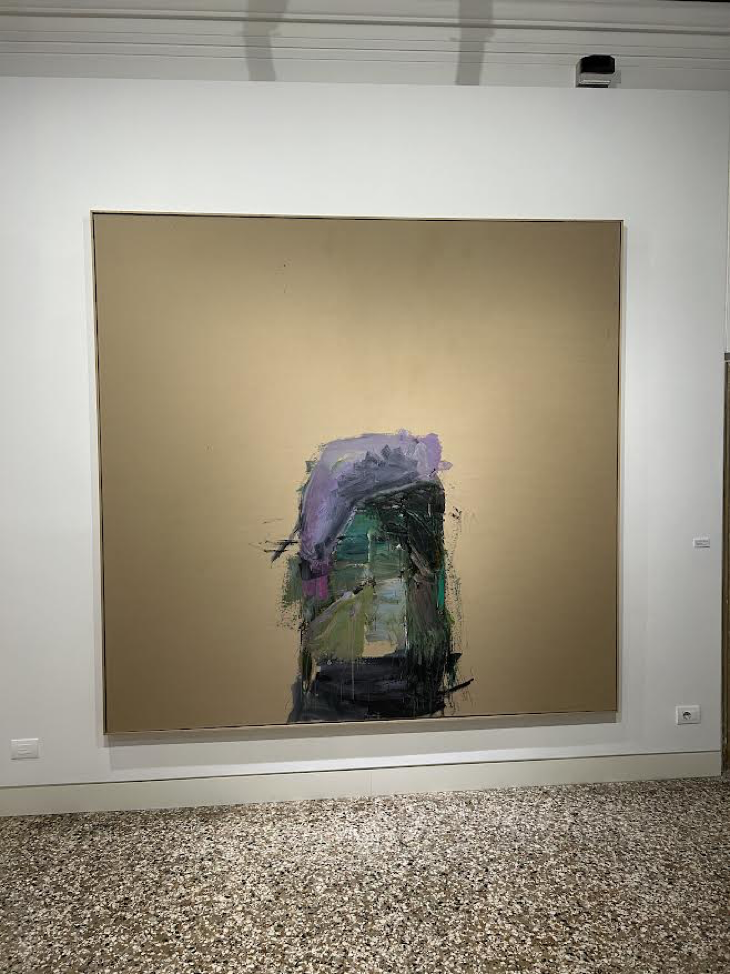
Both painters concentrate attention on a heavily worked center, favor acidic secondary colors (mostly purple and green), and leave their backgrounds largely vacant. Jungwirth is the more abstract of the two, but her work often includes a figurative nod or two.
Large works on paper seem to be having a moment right now. Here’s a big Jeffrey Gibson painting on paper from the set of his paintings in the U.S. Pavilion in the Giardini:
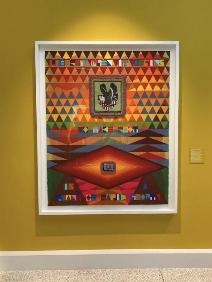
This piece and others showcase Gibson’s mastery of Bauhaus color theory, atypically applied in multiple layers to impart Native American content.
Of course, large works on paper are nothing new. Here’s a Beccafumi cartoon that was recently on view in Siena’s Pinacoteca:
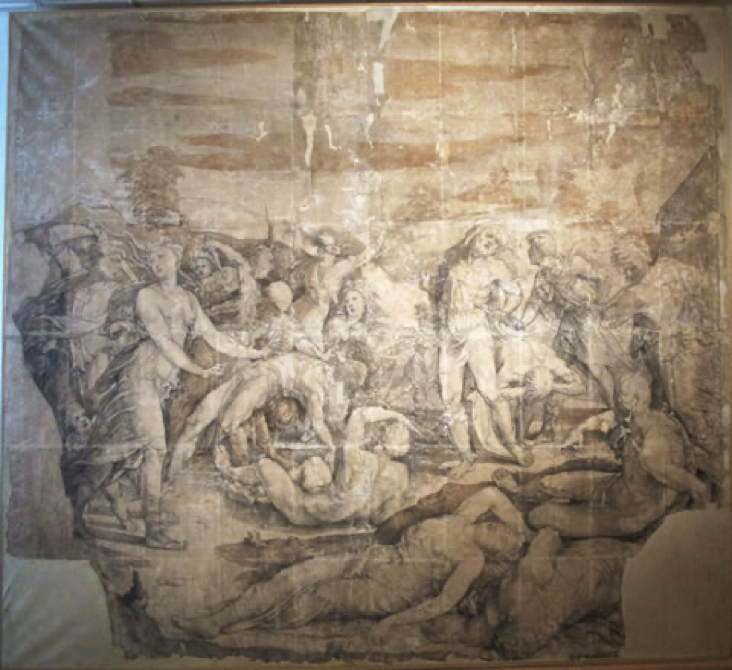
It’s difficult to see in reproduction, but the very large paper support was made by tiling and gluing many small sheets of paper, about standard copy sized, to make a larger whole.
The widely reviewed de Kooning in Italy at the Accademia is a strong companion exhibition. Considering its emphasis on the Parkway paintings and Clamdigger sculpture, though, it is more about de Kooning on Long Island, his few forays to Italy mainly represented by collaged drawings.
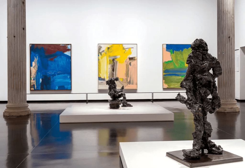
Whatever their thematic conceits, the Jungwirth and de Kooning exhibitions present painting at its highest, most exhilarating level.
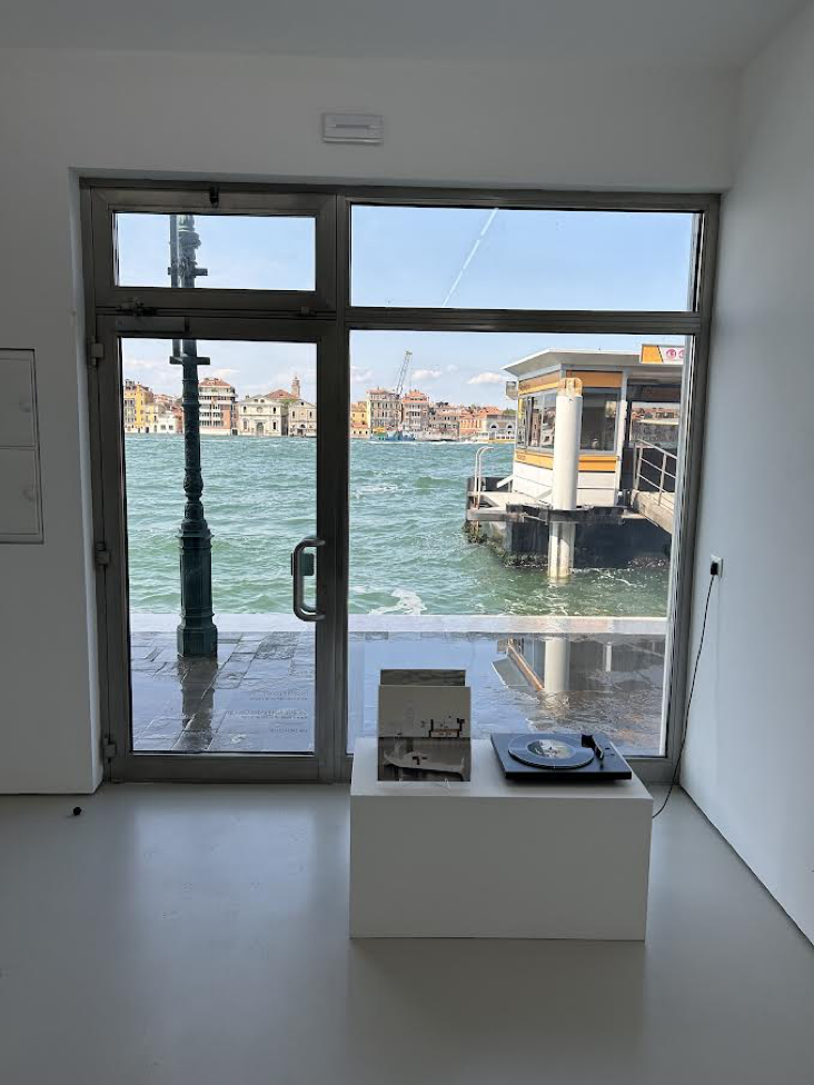
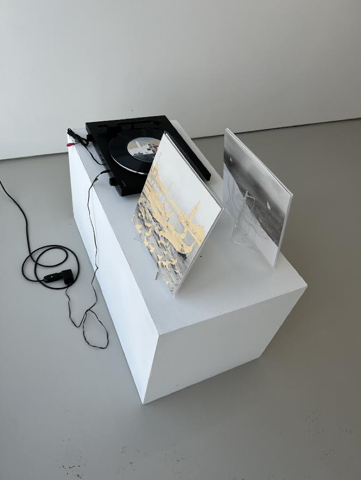
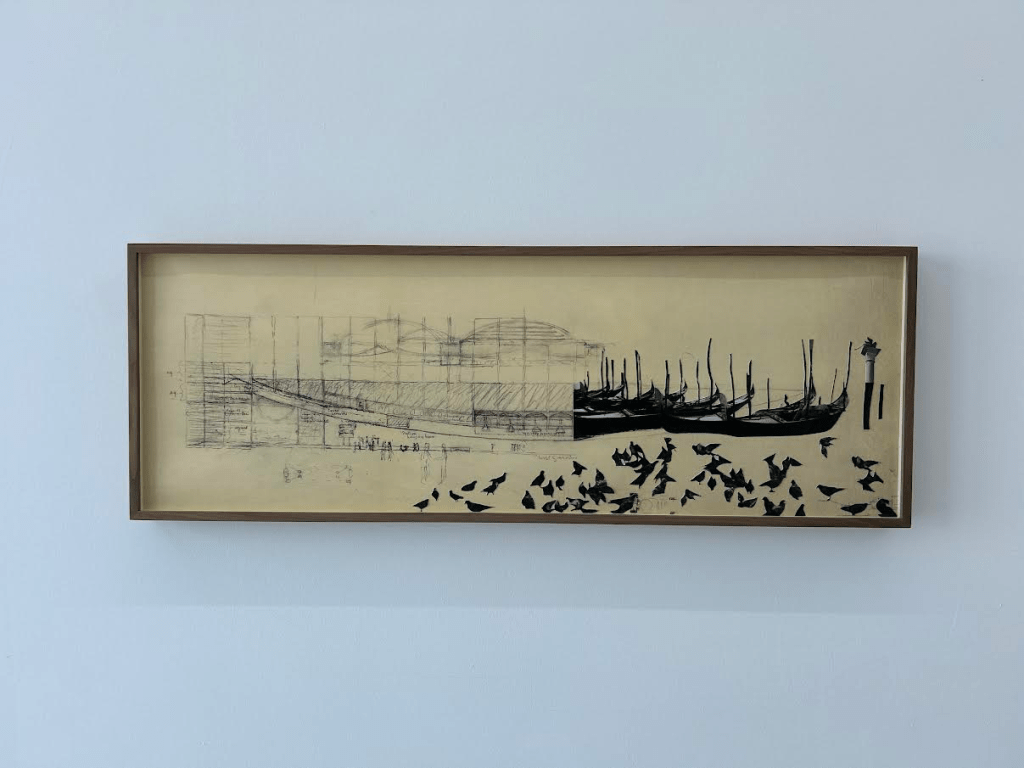
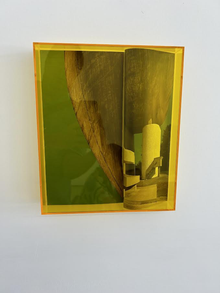
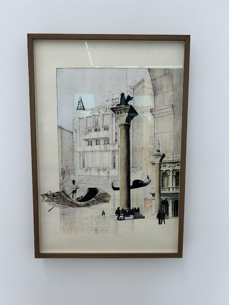
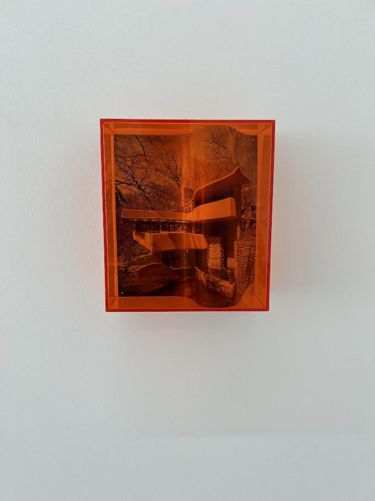
Another fine exhibition was the small but mighty architectural investigation “Unbuilt Venice” at Ncontemporary on the island of Giudecca, which includes drawings and proposals for unfinished projects by four famous architects: Louis Kahn, Le Corbusier, Isamu Noguchi, and Frank Lloyd Wright. The artist Cristian Chironi envisaged this revelation of “missed opportunities.” His own multidisciplinary practice, represented here, includes fashioning sculptures from collaged catalogs and placing them in plexiglass boxes that notionally serve as alternative building proposals. The show also features Chironi’s interpretation of Le Corbusier’s rejected project in sound, played on vinyl.
Venetians value preservation, as reflected in the oft-intoned phrase “Dov’era e Com’era” – “Where it was and how it was.” They have warmly embraced some modern projects, like Carlo Scarpa’s Querini Library, registering less enthusiasm for others, such as Santiago Calatrava’s Ponte della Costituzione. In any case, opportunities for adding new structures are few and far between, and not necessarily a lock even for world famous architects.
Still, it’s hard for me to imagine anyone rejecting a Noguchi playground, lest little children suffer.
About the author: Michael Brennan is a Brooklyn based abstract painter who writes on art.


Thanks for Martha Jungwirth—new to me…
There’s so much new and fresh information here, (and I also welcome the introduction to Jungwirth!) that I have to figure out how to save it for future reference. Michael Brennan is always wonderful to read!
Bravo! Thoughtful and clarifying. I like your observant appreciation of your selected artists’ work.
Two minor thoughts, not really related to your review, but just about materials: Our student Christian Harding reported that Calatrava’s bridge is technically flawed: that beautiful green glass can crack in the cold; per Carmen Bambach, Beccafumi did monochrome oil sketches on paper as preparatory works..