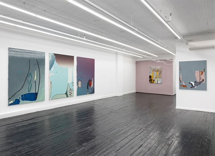
Contributed by Suzanne Joelson / I needed to write about Michele Abramowitz to understand the uncanny allure of her paintings, now on view at Kate Werble Gallery. She brings life, or something like it, to familiar conventions. Shifts in figure and ground trick the eye as it negotiates improbable terrain, that looks more like a dream than a product of twentieth-century formalism. Resemblances abound, shift, dissolve, mimic, repeat. Each painting is at once assuring and destabilizing.
In The Unworthy Augustina marks are a cross between something you would find under a microscope and the fat worms that signify digital drawing tools, suggesting puns and willful misinterpretations. Two dark ellipses hover in a corner like holes or shadows. The luminous nickel yellow dot-dash worms seem offhand, with dark green drop shadows, until you see that the light set is a traced replica of the dark one. They convey instinctual cues, then defy their own plausibility. In contrast, the dark edges of two looming chrome yellow intestine-like branches give them volume. They are visually the most forward elements of the painting, but intuitively the only parts that reach back to the raw canvas. Polyester and black gesso reflect how far we are from old-school abstraction. How much labor is involved in getting a light color when you have started with black?
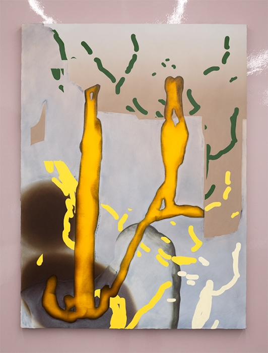
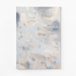
Augustina hangs on a glossy mauve wall that the artist carefully sanded and painted. This lapse into perfectionism is at variance with the neglected edges in Heads / Tails, a diptych of four-foot canvases installed on a corner, perpendicular to each other so the two cannot be fully seen simultaneously. One panel is light, the other shadowed. Shapes that barely seem purposeful repeat, but negative becomes positive, concave becomes convex. An imprint takes on volume depending on the direction of light. The bare edges of the canvases are prominent. Why does such a fastidious painter neglect the edges? Notwithstanding the picture on the surface, “these are objects,” Abramowitz declared when I met her at the gallery. Fiction reverts to things.
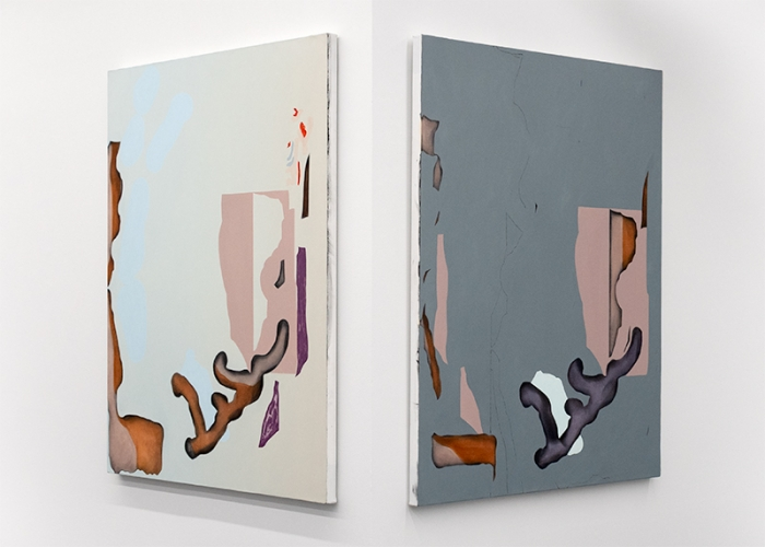
(L): 48 × 40 inches, (R): 48 × 40 inches
These paintings play with our innate habits of seeing. Undermining our expectations, they encourage other ways to imagine the world – to be more agile. In the lighter panel, most elements float in a near blue empty sky. A fat root appears to enter the bottom of a flat shape, then emerges at the top as a twig with smudgy buds coming to life. For a moment, the paint is as delicate and barely formed as a flower. On the darker panel, kindred images are decontextualized fragments of their more stable partners. What does placement mean to interpretation? As we cannot fully see both images at once, there is a lot of back and forth, testing our memories and rendering us unreliable witnesses.
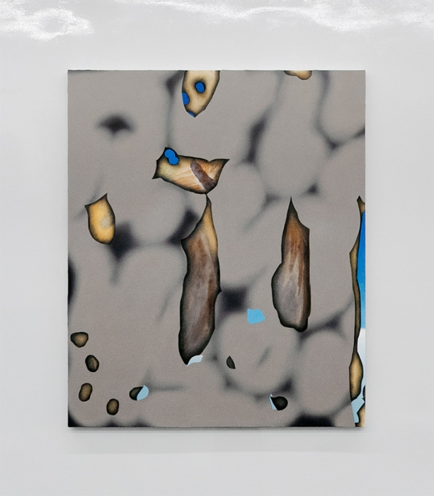
If some of the tactics are familiar, the paint-handling and technique give the work otherworldly distinctiveness. Its strange quality has centrally to do with the discrepancy between what we know and assume, on the one hand, and some other bodily tug, on the other. In The Living Mud, a wiggling wall of beige brain pattern blurs and recedes behind molecular flotsam in a sweaty cranial fever. The charred floaters are from the first stage of painting. One perceives the grain of the canvas as behind, though the shards appear to be in front. Dark modeling at their edges is from sanding. At the lower right edge, the vermicular wall breaks to reveal just enough blue and white to offer escape into a distant mystic vista. Tiny tabs and licks of blue are like digital errors on the surface.
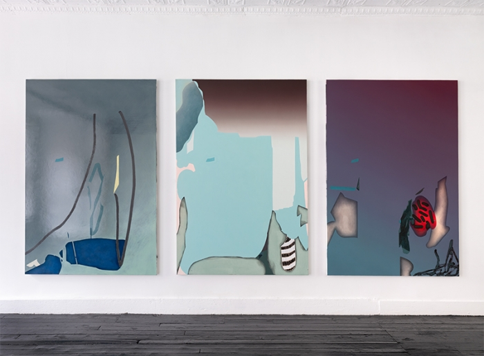
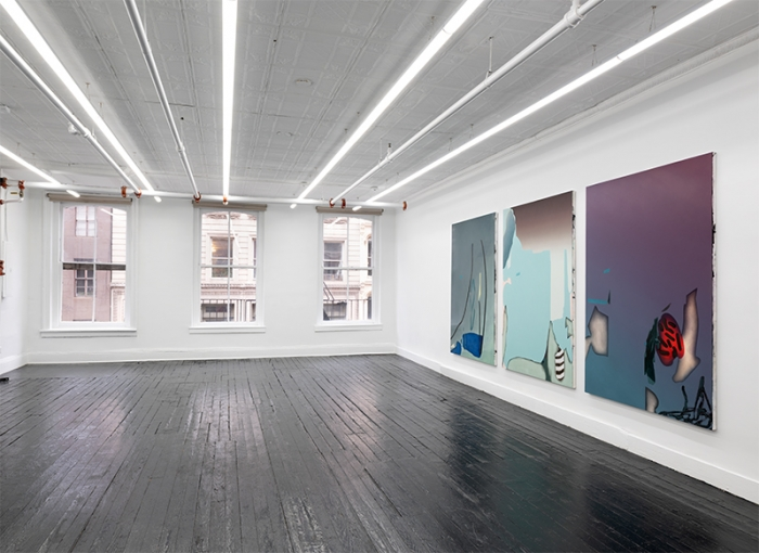
(L): 80 × 54 inches, (C): 80 × 54 inches, (R): 80 × 54 inches
Blue tabs occur again in the large triptych elusively titled Ghost Crickets. The left panel is similar to the middle one, but on a dark rainy day behind glass. Two branches scratch the window. The light clearing in the middle panel turns out to be a blue wall in front of a beautiful climate disaster of a sky. Funny fingers and flat chiseled bones appear in subtle, close-valued, off-key color – Eric Satie’s music heard through the window of someone else’s car. Details come at the edges of shifts in blended spaces. There are shapes that could only come from digital drawing, and visual ideas that echo Hiroshige and Piero de la Francesco released from gravity. The righthand panel feels like what was left behind at the end of the day – charred sticks, a flayed limb. But the imagery does not encourage particular readings, only the anguish and the profound pleasure of making sense and nonsense from paint. Abramowitz’s “intermediate reals” expose the dissonance between image and affect, feeling and imagination, beauty and dread.
“Michele Abramowitz: These Intermediate Reals,” Kate Werble Gallery, 474 Broadway, Third Floor, New York, NY. Through June 28, 2025.
About the author: Suzanne Joelson is a New York painter who works with photography. She teaches at the School of Visual Arts.